


- /
- Librarie online
- /
- Carti in engleza
- /
- Computers
- /
- Web
- /
- Design
- /
- Responsive Web Design with HTML5 and CSS - Fourth Edition: Build future-proof responsive websites using the latest HTML5 and CSS techniques - Ben Frain
Responsive Web Design with HTML5 and CSS - Fourth Edition: Build future-proof responsive websites using the latest HTML5 and CSS techniques
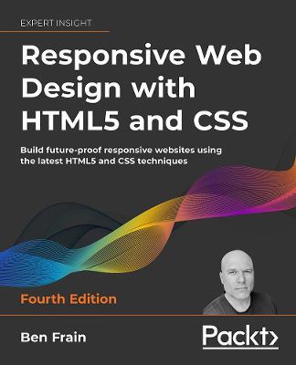
Responsive Web Design with HTML5 and CSS - Fourth Edition: Build future-proof responsive websites using the latest HTML5 and CSS techniques
Harness the latest capabilities of HTML5 and CSS to create a single UI that works flawlessly on mobile phones, tablets, and desktops - plus everything in-between - now with color images!
Key Features: Understand what responsive web design is and its significance for modern web developmentExplore the latest developments in responsive web design and CSS, including layout with Grid and Subgrid, CSS Cascade Layers, Wide Gamut colors, and CSS FunctionsGet to grips with the uses and benefits of new HTML elements and attributes
Book Description: Responsive Web Design with HTML5 and CSS, Fourth Edition, is a fully revamped and extended version of one of the most comprehensive and bestselling books on the latest HTML5 and CSS techniques for responsive web design. It emphasizes pragmatic application, teaching you the approaches needed to build most real-life websites, with downloadable examples in every chapter.Written in the author's friendly and easy-to-follow style, this edition covers all the newest developments and improvements in responsive web design, including approaches for better accessibility, variable fonts and font loading, and the latest color manipulation tools making their way to browsers. You can enjoy coverage of bleeding-edge features such as CSS layers, container queries, nesting, and subgrid.The book concludes by exploring some exclusive tips and approaches for front-end development from the author.By the end of the book, you will not only have a comprehensive understanding of responsive web design and what is possible with the latest HTML5 and CSS, but also the knowledge of how to best implement each technique. Read through as a complete guide or dip in as a reference for each topic-focused chapter.
What You Will Learn: Use media queries, including detection for touch/mouse and color preferenceLearn HTML semantics and author accessible markupFacilitate different images depending on screen size or resolutionWrite the latest color functions, mix colors, and choose the most accessible onesUse SVGs in designs to provide resolution-independent imagesCreate and use CSS custom properties, making use of new CSS functions including 'clamp', 'min', and 'max'Add validation and interface elements to HTML formsEnhance interface elements with filters, shadows, and animations
Who this book is for: Are you a full-stack or back-end developer who needs to improve their front-end skills? Perhaps you work on the front-end and you need a definitive
PRP: 495.92 Lei
Acesta este Prețul Recomandat de Producător. Prețul de vânzare al produsului este afișat mai jos.
396.74Lei
396.74Lei
495.92 LeiPrimești 396 puncte
Livrare in 2-4 saptamani
Descrierea produsului
Harness the latest capabilities of HTML5 and CSS to create a single UI that works flawlessly on mobile phones, tablets, and desktops - plus everything in-between - now with color images!
Key Features: Understand what responsive web design is and its significance for modern web developmentExplore the latest developments in responsive web design and CSS, including layout with Grid and Subgrid, CSS Cascade Layers, Wide Gamut colors, and CSS FunctionsGet to grips with the uses and benefits of new HTML elements and attributes
Book Description: Responsive Web Design with HTML5 and CSS, Fourth Edition, is a fully revamped and extended version of one of the most comprehensive and bestselling books on the latest HTML5 and CSS techniques for responsive web design. It emphasizes pragmatic application, teaching you the approaches needed to build most real-life websites, with downloadable examples in every chapter.Written in the author's friendly and easy-to-follow style, this edition covers all the newest developments and improvements in responsive web design, including approaches for better accessibility, variable fonts and font loading, and the latest color manipulation tools making their way to browsers. You can enjoy coverage of bleeding-edge features such as CSS layers, container queries, nesting, and subgrid.The book concludes by exploring some exclusive tips and approaches for front-end development from the author.By the end of the book, you will not only have a comprehensive understanding of responsive web design and what is possible with the latest HTML5 and CSS, but also the knowledge of how to best implement each technique. Read through as a complete guide or dip in as a reference for each topic-focused chapter.
What You Will Learn: Use media queries, including detection for touch/mouse and color preferenceLearn HTML semantics and author accessible markupFacilitate different images depending on screen size or resolutionWrite the latest color functions, mix colors, and choose the most accessible onesUse SVGs in designs to provide resolution-independent imagesCreate and use CSS custom properties, making use of new CSS functions including 'clamp', 'min', and 'max'Add validation and interface elements to HTML formsEnhance interface elements with filters, shadows, and animations
Who this book is for: Are you a full-stack or back-end developer who needs to improve their front-end skills? Perhaps you work on the front-end and you need a definitive
Detaliile produsului


